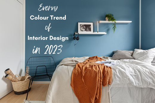
Every colour trend of interior design in 2023
Jan 20, 2023
Some paint companies and brands pick their colour of the year and their choices have a big influence. Not every colour of the year, picked out by these industry leaders ends up being popular, but they do get featured a lot.
If you are thinking of designing your home in 2023, and not sure where to start choosing your home's colour palette, having a look at this article might inspire you.
At the end of the day, designing a home it’s all about what you love and feel comfortable with.
Here are every colour trend of 2023 by famous and influential brands:
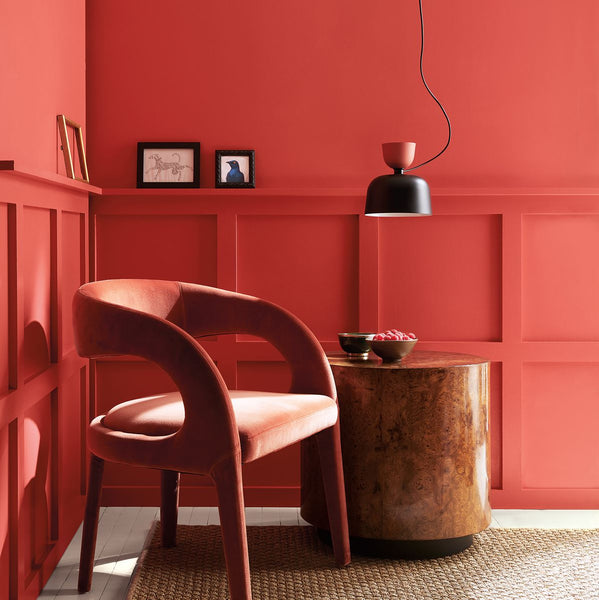
Viva Magneta
This is a vivid and radiant shade of red that is all about self-expression, but it is different from pink blush tones.


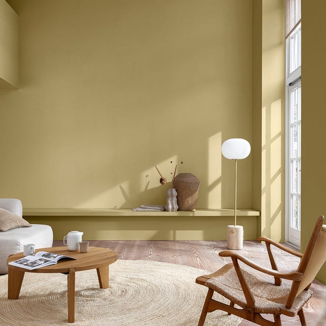
Spanish Moss
In 2022, dark shades of green became popular for the earthly and cozy ambience they create in any space. It is expected that this trend of embracing the colours of nature is going to have a strong foothold in 2023 as well.

That is why paint company, Krylon chose Spanish Moss as their colour for 2023. This dark shade of green resembles the colour of forests and is a highly versatile colour that blends well with many other tones.

From our store


Raspberry Blush
Another bold reddish shade for the year is Raspberry Blush, a hue of orange that brightens up any space with its vivid tone. This colour has been picked by the paint company Benjamin Moore.
Benjamin Moore’s colour marketing and development director believes that people are ready to “bring colour back into the home”, suggesting that more bold and brassy colours are here to stay for a while.

Raspberry Blush is a delightful shade of orange to play with. It brings so much joy to any interior space and clearly makes a statement.
If you are thinking of using this rosy hue, it could be the centrepiece of your colour palette. You can use shades of brown and soft shades of yellow or white to complement it.
From our store

Terra Rosa
This dark hue of pink can be a perfect blending colour as well as the statement colour in your home. Terra Rosa is a delightful and cozy colour picked by Dunn-Edwards.
Sara McLean, colour expert and stylist at Dunn-Edwards described this choice by calling it “embracing nostalgia” and putting wellbeing first.


Terra Rosa transforms your home into a sophisticated yet comfy and pretty space to be in. It can be matched perfectly well with light shades of beige and white or softer shades of pink to create a lovely atmosphere that is homey and delicate.
From our store

Redend Point
This is a dark and subtle tone of pink that warms up your room with elegance. This is in line with the recent trend of earthly colours for home design. Redend Point was picked by the paint company, Sherwin-Williams.

They have described their reason for picking this colour for its calming effect and its inspiration from earthly tones. Sue Wadden, director of colour marketing at Sherwin-Williams believes that Redend Point can make people feel relaxed and yet energised.
Redend Point can be matched with many other tones for a home design such as any shades of red, yellow, green or background shades of white or grey. You can create some mesmerising space using this colour in your colour palette.

From the store


Canyon Ridge
Canyon Ridge is where orange meets pink. This energising and sweet colour is inspired by the colour of terracotta and it has been picked by Better Homes and Gardens at Walmart.
Canyon Ridge goes perfectly well with blue, its opposite colour on the colour wheel and can create soft and cozy environments.


Using this colour combination in your home gives an old-school look that is modern at the same time. Canyon Ridge is a really funky and exciting colour to experiment with and can be complemented with darker shades of red or grey too.
From our store

Blank Canvas
Unlike all the previous colours of 2023 that we have talked about, Blank Canvas is not about making statements. Behr’s colour of the year is a shade of white that practically blends well with any colour. We have seen a kind of icy white in recent years being more popular, but Blank Canvas is a warmer and more welcoming tone of white.


Blank Canvas offers freedom of creativity with other colours and features of the room. You can have warm and cozy colours that go perfectly well with it, or have a bold and loud colour to make some contrast.
Having this colour in your bedroom for some relaxing effect is a great choice. It can also add a nice touch to your living room or kitchen area.
From the store


Vining Ivy
Glidden Paint by PPG has chosen Vining Ivy as its colour of the year for 2023. This colour is a blend of blue and green and is meant to create a calming and tranquil atmosphere.
According to the company, the colour works well in both modern and traditional design styles and can be used in any room or space. The colour expert from Glidden also mentioned that it is versatile, taking out the guesswork of decorating and leaving more time for people to focus on what matters most to them.


Rustic Greige
Rustic Greige is a blend of grey, beige and subtle red undertones that can be paired with earth-tone paint colours. Dutch Boy has picked Rustic Greige as their colour for 2023.

This colour is designed to provide a warm and inviting atmosphere, making it ideal for use in various spaces such as kitchens, bedrooms, and family areas. It's a cozy colour that goes well with basically everything.
Using this colour in your home has a nice calming effect. It provides some elegance and yet it remains neutral.
From our store


Wild Wonder
Another relaxing and subtle colour to add to the list is Wild Wonder. This is a soft greenish hue of yellow that adds a bit of bliss to your room.
UK paint company Dulux has chosen this colour and they believe it helps us connect with “the cycle of life”. Wild Wonder is an earthly tone full of positive energy and calmness.
This could be the new Sage Green colour that has gained so much popularity in recent years. You can add darker shades of beige or green to your colour palette along Wild Wonder to create astonishing atmospheres.
Beverly
Adding to the collection of earthly green colours in this list, Beverly is a fresh and buoyant green selected by Farrow & Ball.


Beverly gives you the sense of being in a forest right away. It is a sophisticated colour that is also simple and playful. It can be used to create a welcoming and cozy home where you feel closer to nature. Beverly can be easily paired with light shades of grey or white, and for a bit of character, dark beige or green colours
From our store


Alizarin
Alizarin, a dark and sombre but pleasantly warm auburn, is Graham & Brown's colour of the year 2023. It was inspired by the beauty found in organic earthy tones of russet reds and spicy terracotta colours. Bold red is a daring departure from beige and grey neutrals, but it feels comfortable because the proper shade of red can produce a cosy atmosphere. The moody lighting provides a welcoming atmosphere that seems like a warm embrace.

Alizarin is versatile and perfect for any room, this melancholy colour can produce an intimate impression in a smaller room or turn bigger rooms into an elegant home. It would add a tiny bit of earthy accent colour to a living room or bedroom decorated in the Japandi style.

From our store


Templeton Pink
Different shades of pink have become more popular in recent years, given they provide a nice sophisticated and joyful atmosphere and remain subtle. These pinks contain bluer undertones to avoid the sweetness associated with pastel shades.

Templeton Pink is another Farrow & Ball’s pick for 2023, and it falls somewhere between popular pink colours such as Pink Ground and plaster pink colours. It is a charming neutral colour that welcomes warmth and avoids being too saturated.


Unlike other brands, Albany has come up with five shades of orange as their colour of the year. As the name suggests this is a really fun and exciting colour palette. Optimistic Orange includes shades of orange and red that are full of ecstasy and can help you create a dopamine-fueled space in your home.

The trend of dopamine-dressing is the concept of using bright and vibrant colours to enhance your dopamine reception. It has been advised by psychologists for depression patients.
There are countless ways of using this colour palette in your home. It is just such a fun colour to play around with. They can be especially amazing for living rooms and kitchen areas where we spend a lot of time in. It certainly does not result in mundane designs.
From our store


Wine Dark
Because of its calming and peaceful characteristics, blue has always been a popular option for bedrooms paint colour to promote a better night's sleep. In recent years, there has been a strong trend for darker, bolder blues that are inspired by starry skies and deep oceanic vistas. With the release of the new paint hue "Wine Dark," Farrow & Ball have delved into that depth of blue.

Farrow & Ball says this colour is "Inspired by midnight skies”. This spiritual colour is named after the epithet Homer used to describe the sea. When people are looking for gloomy blues to decorate their houses, we believe that this crisp navy will become the new Hague Blue.

From our store

Serene Blue
The Dulux Color of the Year 2022 Blue Skies helped sky blue become a popular shade last year. According to experts, this upbeat shade of pale blue will still be relevant and significant when it comes to decorating homes in 2023.

Serene Blue is a softer shade of blue that is extremely calming and relaxing. It is perfect for bedrooms but can be applied anywhere in the house.
Matching this with white or brown colours is perhaps the best way to utilise it in your home, but the sky is the limit, or it is Serene Blue.

Fresh Lilac
There is no doubt that pastel colours are big right now. Therefore, this list would not have been complete without featuring some pastel colours. Yes Colours has picked Fresh Lilac as their colour of the year.
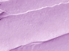
This is a cute and soft colour that adds some romance and luxury to your environment. Fresh Lilac is a pale shade of pinkish purple that has captured the hearts of many designers in recent years.

Magneta Pink
With Myland's daring selection of magenta pink as the colour of the year for 2023, the power of pink is being elevated to a new level.
Magenta Pink is a bold and cheerful shade of pink that transforms any environment with its joyous vibe. If you love pink, this is the colour to be excited about.
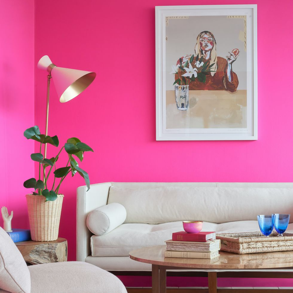
When using this colour, however, it is recommended to use it in small doses. Magenta Pink is an extremely dominant and bold colour that can take hold of any other colour in your room.
This can be a great addition to your colour palette as a small amount will go well with most colour palettes and it will bring so much joy to your home.